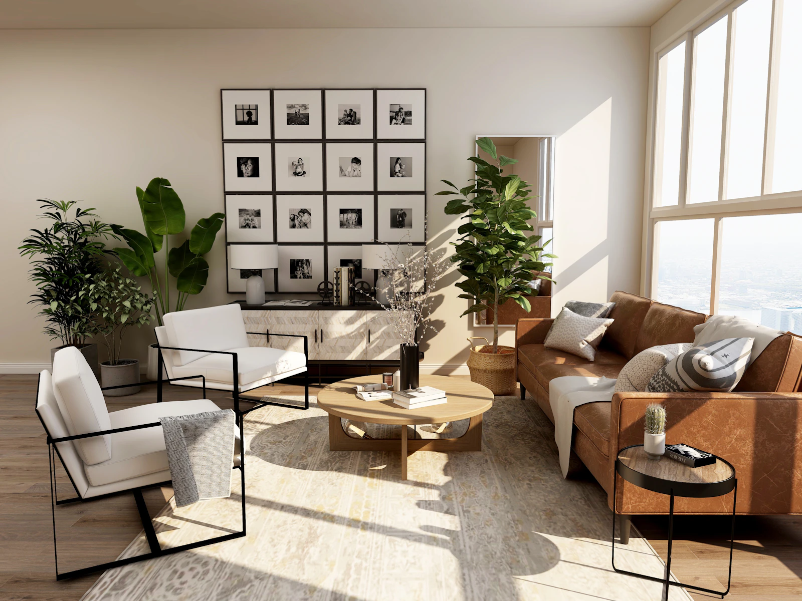
How to use the material palette builder
A strong project usually rests on a short list of materials used with conviction. This builder gives you a starting palette for six popular styles across living rooms, kitchens, bathrooms, bedrooms and facades. Each material comes with a representative swatch, a finish, an estimated light reflectance value (LRV) and a role in the room, so you can go from a style word in the brief to a sample board quickly.
- Choose a style from the client brief: Japandi, Scandinavian, Industrial, Mediterranean, Mid-century modern or Contemporary minimal.
- Choose the space. Interior spaces get floor, walls, joinery, worktop or feature surface, metalwork, textiles and an accent. "Facade" switches to cladding, roofing, window frames, soffit and paving.
- Try variation B for a second take on the same style, often with a different timber or stone.
- Check the contrast note. It compares the estimated LRV of the floor and walls (or cladding and frames) against the 30-point guidance.
- Copy the palette and prompt into your notes, or open Moodboard to Room to see the materials rendered together in a room.
How the palette and LRV are worked out
Proportions: dominant ≈ 60%, supporting ≈ 30%, accents ≈ 10%
Linear RGB: c = (s/255 ≤ 0.04045) ? s/255 ÷ 12.92 : ((s/255 + 0.055) ÷ 1.055)^2.4
Estimated LRV ≈ 100 × (0.2126 R + 0.7152 G + 0.0722 B)
Contrast check: |LRV floor − LRV wall| ≥ 30
The swatch bar shows each material in proportion to how much of the space it typically covers, following the 60-30-10 rule used in interior colour planning. LRV is estimated from the swatch colour with the relative luminance formula, which tracks measured LRV reasonably well for matte, untextured surfaces. Glossy, textured or heavily grained materials can differ by 5 to 10 points, so always confirm the product's published LRV before relying on it.
| Style | Signature materials | Character |
|---|---|---|
| Japandi | Light oak, limewash, paper, linen, blackened steel | Calm, low, natural |
| Scandinavian | Ash or birch, white walls, wool, brushed steel | Bright, simple, soft |
| Industrial | Polished concrete, brick, black steel, leather | Raw, robust, dark accents |
| Mediterranean | Terracotta, lime plaster, travertine, aged brass | Warm, textured, sunlit |
| Mid-century modern | Walnut, terrazzo, teak, brass, mustard textiles | Warm wood, graphic colour |
| Contemporary minimal | Microcement, white oak, quartz, matte black | Seamless, quiet, precise |
Worked examples
A Japandi living room
The palette pairs a light oak floor (estimated LRV about 45) with warm white limewash walls (about 77). The difference of about 32 points passes the contrast check. Joinery in rift oak, a stone side table in grey limestone, blackened steel details, natural linen and a muted moss accent complete it.
An industrial kitchen
Polished grey concrete floor, white-painted brick walls, smoked oak or black-stained cabinetry, a honed dark granite worktop and black steel shelving. The floor and walls differ by more than 30 points; the dark worktop and cabinets carry the drama.
A Mediterranean facade
White lime render cladding, terracotta roof tiles, dark green timber window frames and a travertine terrace. Render against frames gives a strong LRV contrast, so openings read clearly from the street.
Who this builder helps
- Architects preparing concept-stage material boards and facade studies.
- Interior designers translating style words from a brief into specific finishes.
- Visualisers who need a consistent material list to brief a render.
- Developers and agents setting a finishes standard for a scheme.
- Homeowners planning a renovation and choosing finishes that go together.
- Students learning how material palettes define a style.
Practical tips
- Turn the palette's colours into paint codes and a 60-30-10 split with the room color palette generator.
- Quantify the finishes: floors with the tile calculator and walls with the paint calculator.
- Gather style preferences first with the design brief generator.
- Limit metal finishes to one or two, and repeat every material at least twice in a room.
- View samples in the room's real light, at the angle they'll be seen, before you specify.
Identify materials in a reference photo with Material ID, then render your palette as a finished room with Moodboard to Room.