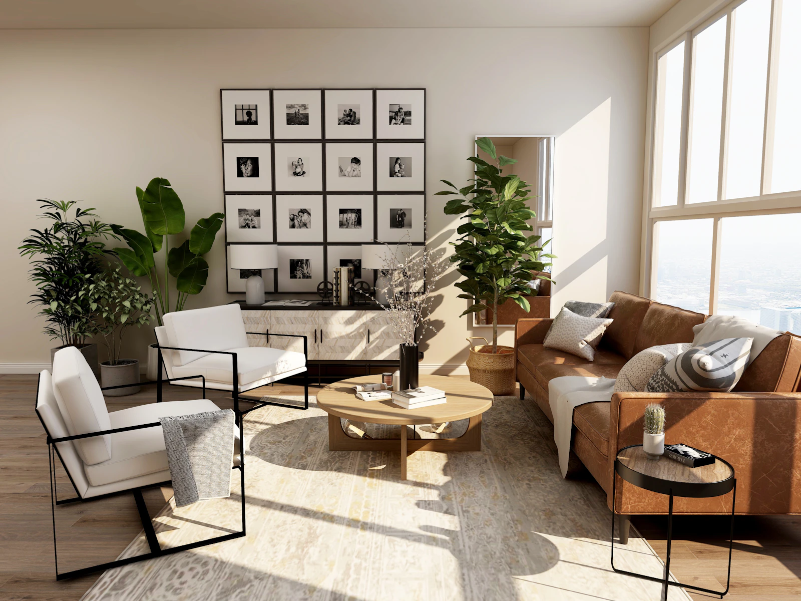
How to use the room colour palette generator
Choosing colours is often where a project stalls: a client loves one shade but cannot picture the rest of the room. This generator turns a single base colour into a balanced palette using colour theory and the 60-30-10 rule, so you can propose a full scheme in seconds, test alternatives and hand over exact hex and RGB codes to match in a paint or material library.
- Pick a base colour with the colour picker. Use a colour you must keep, such as a sofa, floor, brand colour or brick.
- Choose a harmony: complementary for contrast, analogous for calm, split complementary for softer contrast, triadic for energy, or monochromatic for a single-hue scheme.
- Choose a mood: light and airy keeps the dominant colour pale, balanced uses mid tones, and dark and moody makes the walls deep.
- Add the surface area if you want to see how much of the room each colour covers.
The results show the dominant (60%), secondary (30%) and accent (10%) colours with codes, plus a deep trim colour and a second accent, the contrast ratio between accent and dominant colours, and the area for each share.
How the palette is built
Secondary (30%) = Base colour
Dominant (60%) = Base hue, low saturation, lightness set by mood
Accent (10%) = Base hue + harmony angle, higher saturation
Contrast ratio = (L1 + 0.05) ÷ (L2 + 0.05)
Colours are worked out in HSL (hue, saturation, lightness). The harmony sets the accent hue as an angle around the colour wheel from the base, and the dominant colour is a muted version of the base hue so the large surfaces feel calm. L1 and L2 are the relative luminance of the lighter and darker colours, the same measure used by WCAG.
| Harmony | Accent hue from base | Feel |
|---|---|---|
| Complementary | 180° | Bold, high contrast |
| Analogous | 30°, second accent −30° | Calm, cohesive |
| Split complementary | 150°, second accent 210° | Contrast with less tension |
| Triadic | 120°, second accent 240° | Lively, playful |
| Monochromatic | 0°, darker and stronger | Quiet, sophisticated |
Worked examples
A sage green living room
Starting from sage green (#5B7A6A) with an analogous harmony and the light mood, the sofa and curtains carry the sage, the walls become a pale green-tinted off-white and the accent shifts toward a stronger teal for cushions and a rug. In a 60 m² room surface, that is 36 m² of the pale wall colour, 18 m² of sage and 6 m² of accent.
A navy and ochre study
A navy base with a complementary harmony gives an ochre or mustard accent. Choosing the dark mood turns the dominant colour into a deep blue-grey for the walls, which suits a study or snug and makes brass, leather and ochre accents glow.
A terracotta facade
For a house with terracotta tiles as the base, a split complementary harmony gives blue-green accents for the front door and window frames, while the light mood suggests a warm render for the main walls, balancing 60% render, 30% tile and 10% joinery.
Who this tool helps
- Interior designers building quick colour schemes for client presentations.
- Architects exploring facade and material palettes at concept stage.
- Home stagers and property marketers picking neutral but appealing colours for sale.
- Students learning colour theory and the 60-30-10 rule.
- Homeowners planning a repaint without hiring a colour consultant.
Tips for using a colour palette
- Test sample pots on the real walls; north light cools colours and south light warms them.
- Count floors, rugs and large furniture in the percentages, not just the walls.
- Work out how much paint the 60% colour needs with the paint calculator, and get the room area from the square footage calculator.
- Darker dominant colours absorb light, so check the room's daylight with the daylight factor calculator first.
- Repeat the accent at least three times around the room so it looks intentional.
Want to see the palette on your own walls? Upload a photo of the room and recolour it with Wall Paint, or restyle the whole space with Room Redesign.